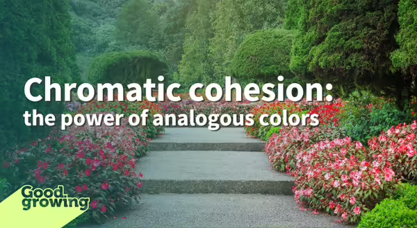
A few weeks ago, we began a discussion about color. We started with complementary colors, those that are opposite of each other on the color wheel. This week we explore analogous colors.
Throughout this color exploration, we might be tempted to think only of floral color but many plants offer color in their foliage. Vegetative plant parts are available in a variety of colors and can be used to reinforce a color scheme.
What are analogous colors?
Analogous colors are those that lie adjacent to each other on the color wheel. These colors are closely related and share similar undertones. We may use primary colors to describe the analogous colors related to it such as yellowish-green, green, and blue-green.
To choose an analogous color scheme, choose a single color from the color wheel then expand the color palette to include one or two colors directly adjacent to the chosen color. For example, if orange is selected as the primary color, the pallet can be expanded to include yellow and, or red. Because a variety of colors is made using a range of values and hues, the choice of how far to stretch beyond the primary color is the choice of the designer.
Choosing secondary (and tertiary) colors that are closely related to the primary color creates what may be referred to as a monochromatic color palette. Sticking with our example of orange as the primary color, a limited range of colors is described as sienna, coral, pumpkin, and carrot. These colors reduce the amount of red or yellow hues visible in the scheme.
Both are considered analogous color choices, but the effect can vary greatly. Neither is right or wrong, it is design, so it is up to the designer to decide which is preferred.
Why use an analogous color scheme?
When used in a design, they can create a harmonious, pleasing appearance. An analogous color scheme is an easy way for amateur or hobby landscape designers to focus on plant choices instead of color coordination. When used in a larger-scale landscape, colors that are similar in color can create the look of a mass planting, creating a strong visual impact. When experienced from a closer perspective, analogous color schemes have variety and interest in the subtle color differences.
The psychology of color
Although focused on a specific color hue, the idea of an analogous color scheme provides an opportunity for abundant personalization and expression. Depending on primary and secondary colors, gardens designed using analogous colors have the potential to invoke emotion, create a mood, or influence behaviors.
A person’s response to color is affected, in part, by personal preferences, cultural influences, and life experiences. Pay attention to the use of color use throughout your day and you may notice how color can exert an influence over feelings, even decisions. An easy place to observe this is with company branding. Bold, bright colors are often used to inspire action and capture your attention. Cool, or subtle colors may be used to inspire trust, communicate professionalism, or maybe tranquility. Similar reactions to colors occur in the landscape.
Green, blue, and purple tones are known as cool colors and can evoke feelings of calm, creating a landscape that is serene and relaxing. Natural elements associated with cool colors are bodies of water, the sky, and woodlands. Some of my favorite cool color-themed plants include:
-
Virginia Bluebells (Mertensia viginica)
-
Wild Blue Indigo (Baptisia australis)
-
Virginia Spiderwort (Tradescantia virginiana)
-
Lead plant (Amorpha canescens)
-
New England Aster (Symphyotricum novae-angliae)
A color scheme that utilizes hues of red, orange, and yellow are identified as warm colors. In the landscape, warm colors are reminiscent of natural elements of fire, heat, and the sun. Using these colors can create a landscape that is vibrant and exciting. I tend to favor cool colors but here are a few plants that offer warm colors that I adore:
-
Columbine (Aquilegia canadensis)
-
Cardinal Flower (Lobelia cardinalis)
-
Butterfly weed (Asclepias tuberosa)
-
Yellow Coneflower (Ratibida pinnata)
Good Growing Fact of the Week: The use of color in the landscape can extend beyond the plants. Interesting, inviting gardens often include hardscape elements such as walkways, patios, pergolas, seating areas or sculptures. Carefully considering the color of these elements can create a space that is coherent and appealing.
Thank you for reading!
Sign up for our emails! Want to get notified when new Good Growing posts are available? SIGN ME UP
Give us feedback! How helpful was this information (click one): Very helpful | Somewhat helpful | Not very helpful

