Color Contrast Checkers
Use free online tools to find out if a specific color combination meets WCAG 2.0 AA requirements.
Color is often used to convey meaning or enhance the appearance of text and design elements on websites, in digital documents, and on social media. Selecting color combinations with sufficient contrast between foreground and background colors ensures that information can be perceived and accessed by the widest range of users, including those with low vision or those who cannot see the entire color spectrum.
- Graphics
- Presentations
- PDF flyers, handouts, and tip sheets
- Documents
- Email content
- Video content
- Charts and graphs
Contrast Standards
Illinois Extension’s Accessibility Policy follows WCAG AA 2.0 contrast standards to support minimum requirements for color contrast ratios between foreground and background text or essential graphical elements in digital spaces.
Required Contrast (Foreground and Background)
- 4.5:1 contrast for regular, non-bold text at 14 pt. or smaller
- 3:1 contrast for large text at least 14 pt. AND bold
- 3:1 contrast for large text at least 18 pt. non-bold
- 3:1 contrast for graphic elements that convey essential information
Hyperlink Contrast
- 4:5.1 contrast between link text color and background
- 3:1 contrast between link color and surrounding text
- Underline hyperlinks as well for added clarity
Exceptions
Text or design elements that are not essential to understanding the content do not have contrast requirements. Text included as part of a logo or wordmark has no contrast requirement. Instead, follow Illinois Extension’s brand guidelines.
Examples
To put color contrast best practices into perspective, review examples of two graphics below, which represent a type of event graphic commonly used within the organization for marketing and promotional efforts. All text in the options provided is at 18 pt and above as created. Except for color choices, the examples are identical in design, which includes the following elements from left to right:
- Photo of a yellow, orange, and brown pollinator feeding on an orange zinnia
- Brand element in lower left corner: Orange "Block I" with blue outline
- Vertical, three-color geometric shape separates the photo from the rest of the design
- Single, solid color backs the remainder of the graphic.
- Text at top right: March 25 | Noon.
- Event name text: Attracting pollinators to your backyard landscape.
- Icons of seventeen flying butterflies.
- Illinois Extension brand text.
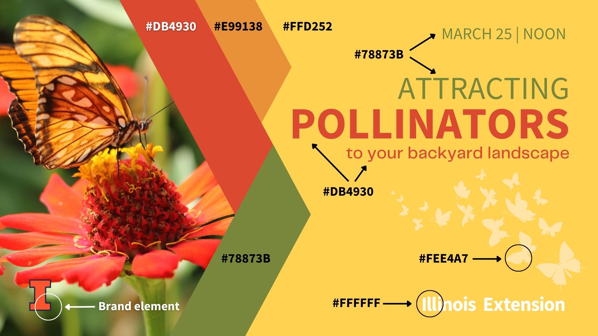
Option A
In the graphic example below, background color and foreground text colors do not meet WCAG AA 2.0 color contrast ratio standards.
Contrast ratios
- Background color #FFD252 and olive green foreground text color #78873B result in a failing 2.73:1 contrast ratio.
- Background color #FFD252 and red-orange foreground text color #DB4930 result in a failing 2.91:1 contrast ratio.
Exceptions
Elements listed below, while failing contrast standards against the yellow background color #FFD252, are exempt from contrast standards:
- Design Elements:
- Vertical, geometric shape: colors #78873B, #DB4930, and #E99138.
- Icons of flying butterflies #FEE4A7.
- Brand Elements:
- "Illinois Extension" brand text #FFFFFF.
- University of Illinois "Block I": Illini Orange #FF552E with Illini Blue #13294B outline
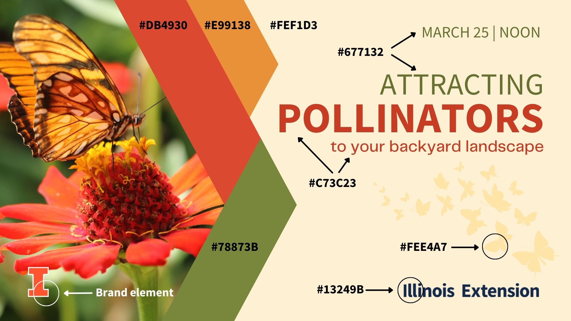
Option B
Adjusting both background color and text color in Option B allows the graphic to pass WCAG 2.0 AA 4.5:1 contrast ratio standard. Choosing a different approved version of University of Illinois Extension brand elements also increases contrast; while those elements are technically exempt under WCAG 2.0 AA, Illinois Extension's brand guidelines call for use of approved elements that support the best contrast possible.
Color adjustments (from Option A to Option B)
- Background changed from #FFD252 to #FEF1D3.
- Green text changed from #78873B to #677132 for a 4.7:1 contrast ratio against the updated background color.
- Red-orange text changed from #DB4930 to ##C73C23 for a 4.57:1 contrast ratio against the updated background color.
- Illinois Extension text (brand element) changed from #FFFFFF to Illini Blue #13429B, resulting in an 11.97:1 contrast ratio.
- Block I (brand element) changed to Illini Orange #FF552E outlined in White #FFFFFF to provide a higher contrast against the photo backing it.